Branding That Inspires Movement Through Inclusivity
The SPARC Alberta program is a child- and youth-focused sport, physical activity, and recreation collaborative. When they launched the program, a brand identity was needed to communicate inclusivity and movement.
The Goal
The Alberta Recreation and Parks Association needed a visual identity for a new program launch. The SPARC Alberta program is a child- and youth-focused sport, physical activity, and recreation collaborative. The identity needed to communicate inclusivity, movement, and fun.
Working with the project team, we defined key attributes the brand and logo needed to express:
The logo should be easy to understand & interpret
Representation of the human form should be abstract and inclusive
The final brand should communicate upward movement to represent positivity, hope, and growth
The brand should appeal to both sports and recreation associations
The Approach
Working with the SPARC Alberta team, we defined key attributes that the identity should express and began sketching ideas for an identity based on those key attributes.
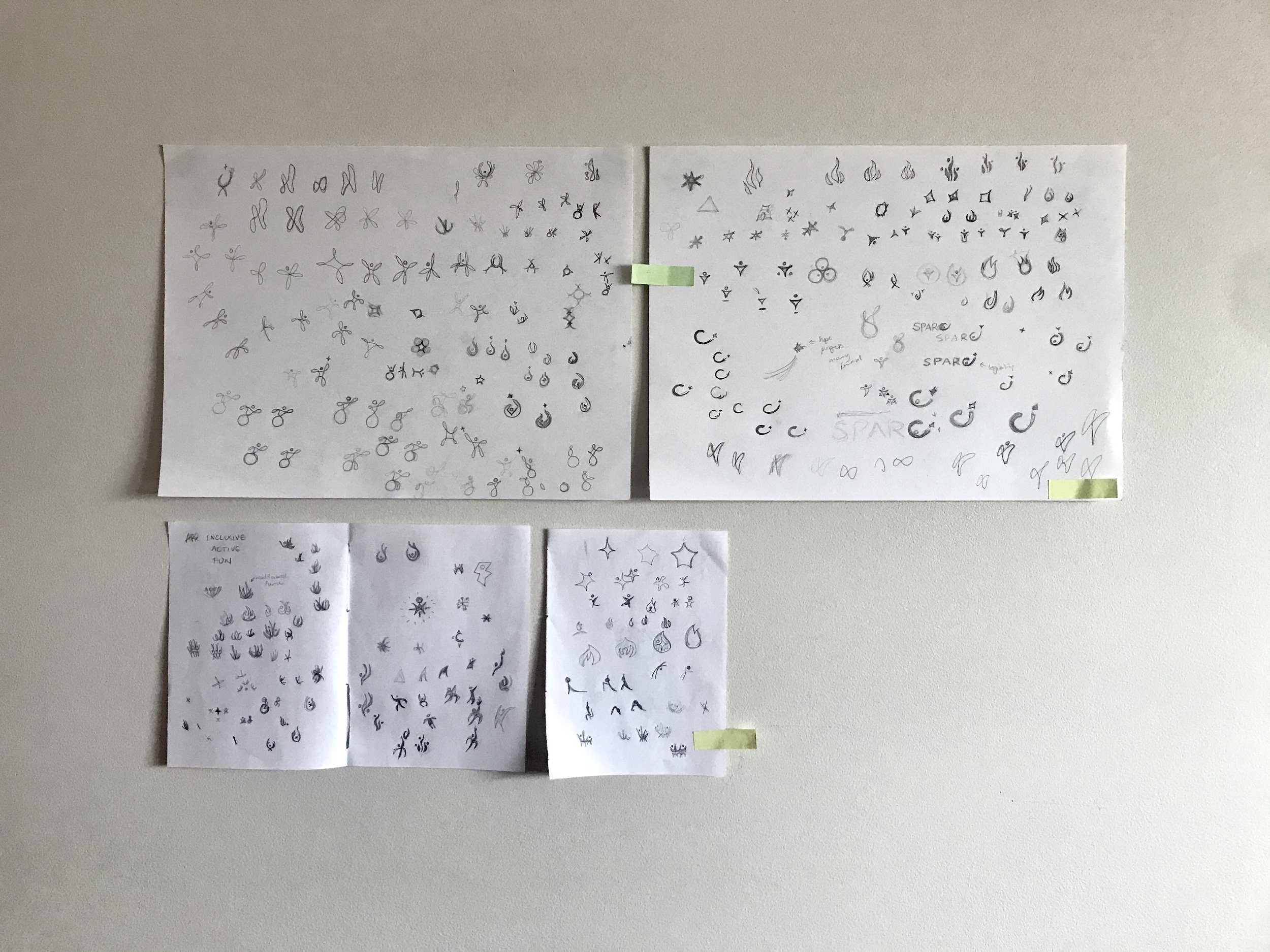
Logo concepting starts with pencil sketches to get as many ideas as possible on paper.
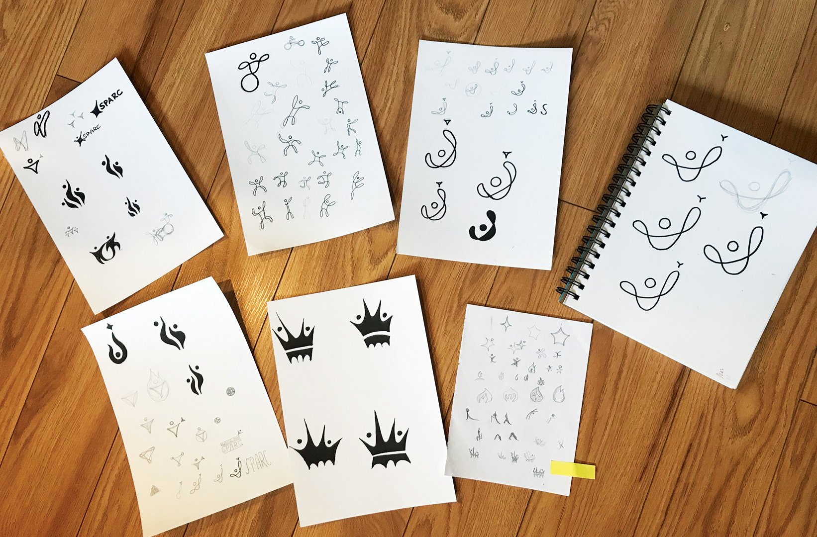
Initial concepts are refined with pen or marker at larger sizes.
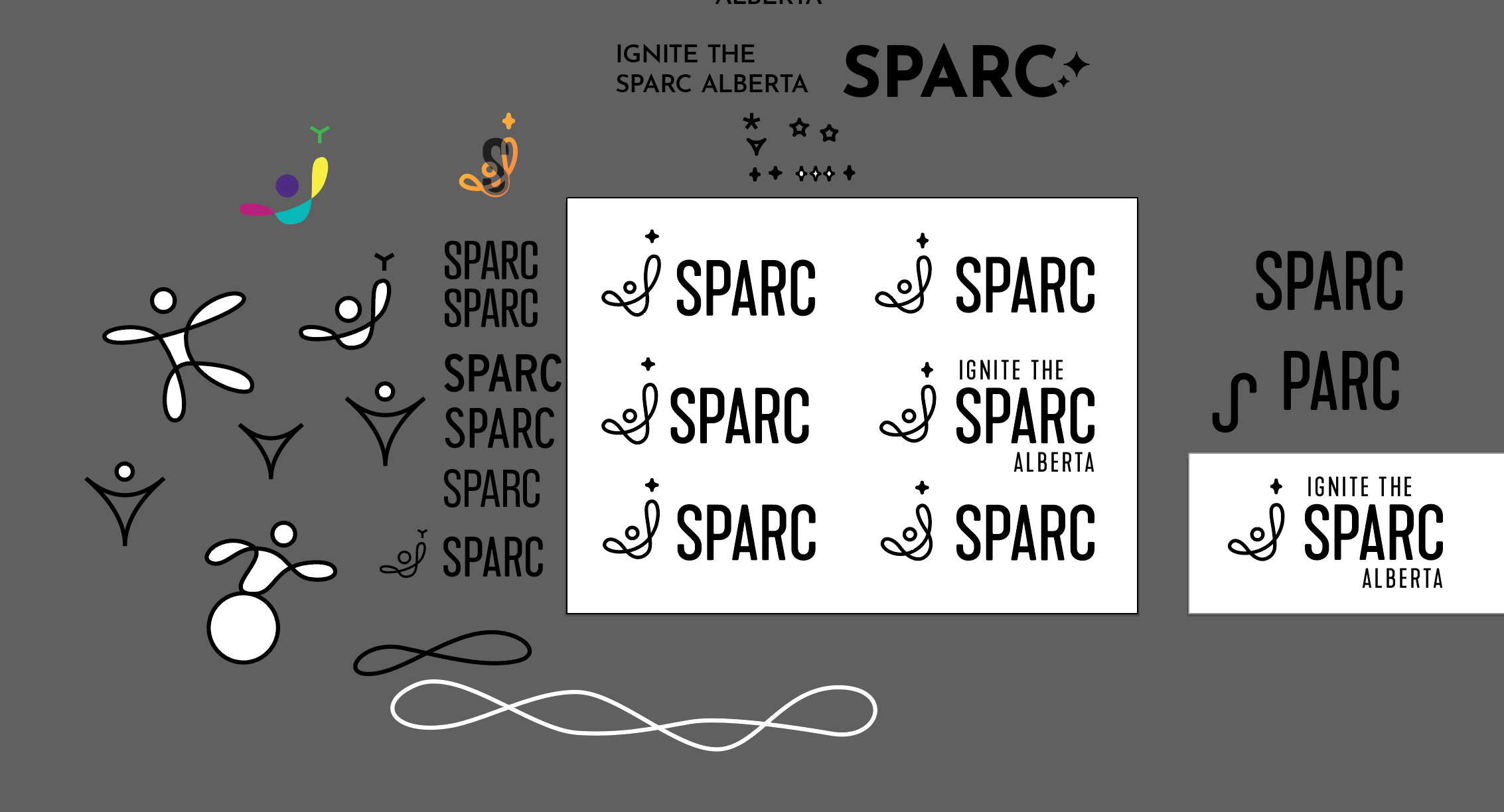
Digital concepting is initially kept in black and white, focusing on the quality of the shapes and visual balanced. This also ensures the final logo works in single-colour applications.
The Final Product
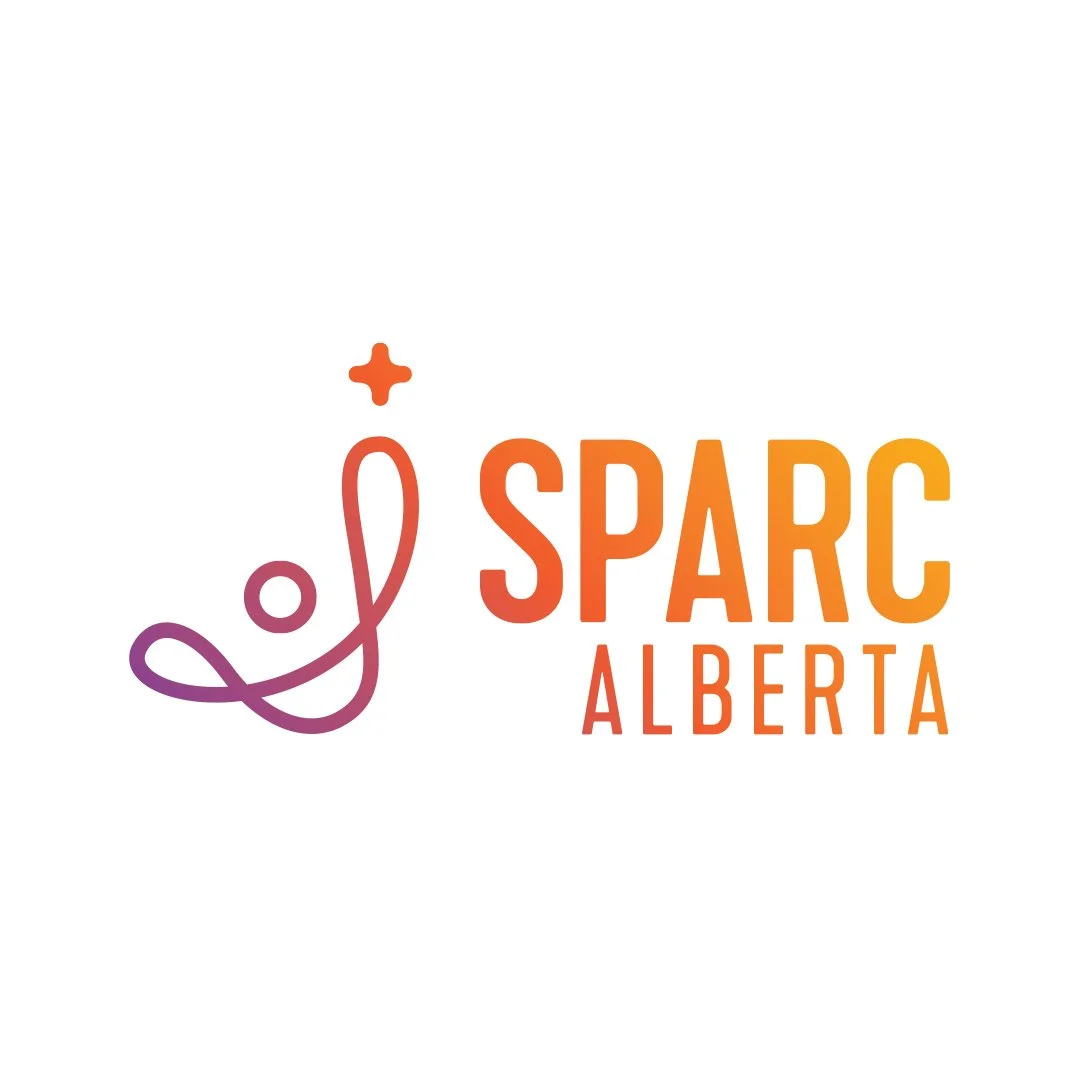
The final design for SPARC Alberta is based on an abstract human form reaching upwards. A warm, vibrant gradient adds a spirit of fun, while also representing people of all backgrounds and abilities.
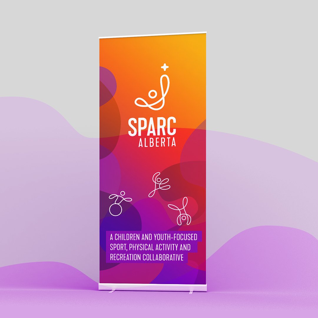
Roll up banner design

Identity Guidelines
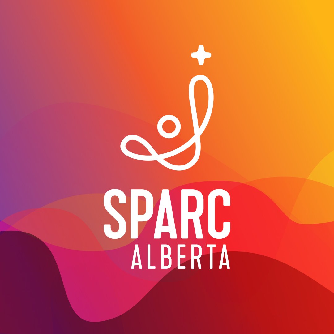
Vertical variation of the SPARC Alberta logo
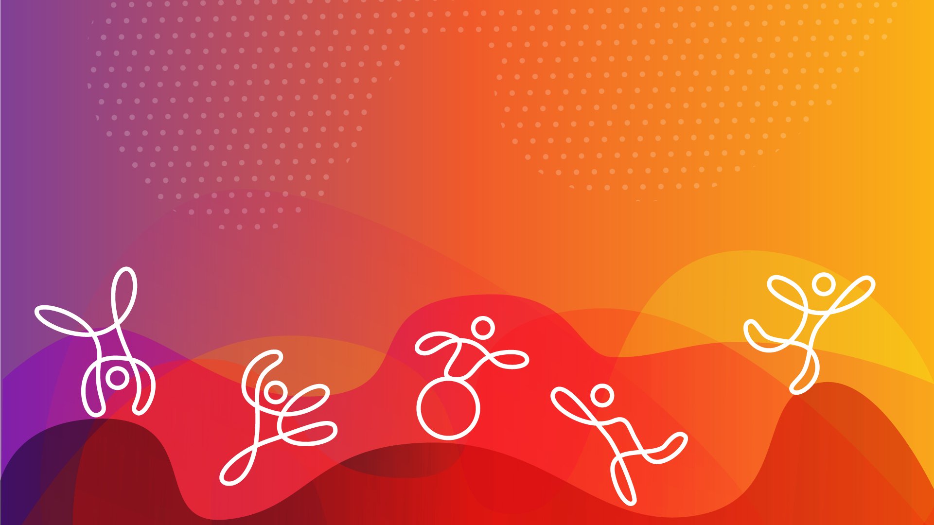
Beyond the Logo
The abstract human form was expanded beyond the logo into a set of inclusive human icons that demonstrate physical activity without being limited to sport or recreation.